S T O R Y
2 years and 17 stores later - it’s the Superfood brand that might not have ever been. Meet everbowl.
Responsible for: Ownership partner, naming, logo, brand concept, belief system design, iconography and illustration, copywriting.
—
Our kids played soccer together. Well, at least they practiced at adjacent fields. We met as we walked the unusually long pathway back to the parking lot. He was a self-proclaimed serial entrepreneur who had a business idea so we met to talk about the new idea over acai bowls. I had never had one - I said “wow - that was surprisingly tasty - we should start a place like this.” He said “funny you should say that".

Turns out, this dude had a serious superfood recipe! Actually, he had like 16.
Jeff and I began talking a lot. About names and logos… it’s funny, we never once spoke again about the business we originally sat down to discuss. Funny too - it was another really cool, really brilliant idea.


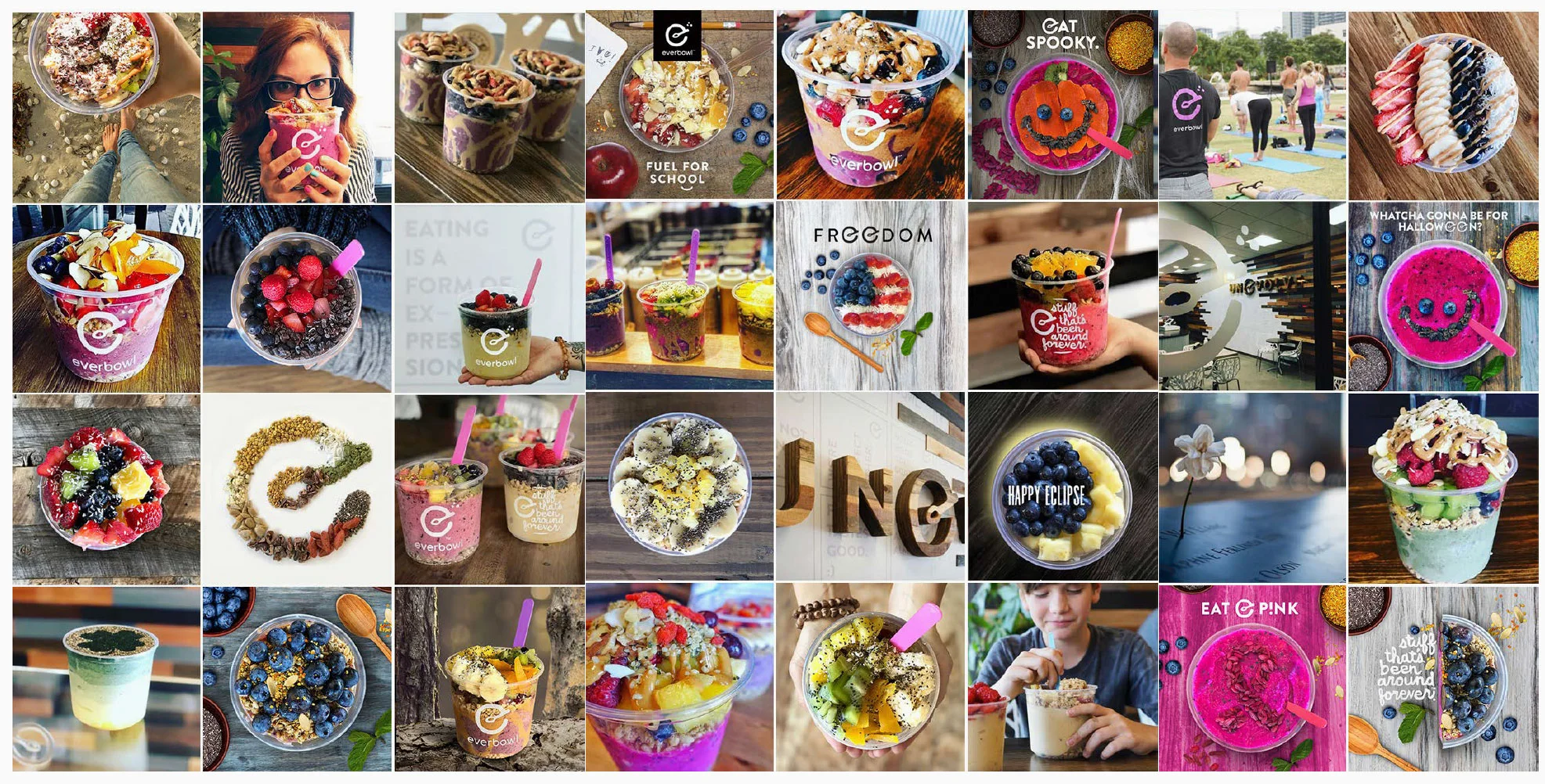
We talked about how we hated how every unhealthy, sugar-adding, natural-claiming company uses the buzzword list: natural, healthy, organic, nutritious. I wanted an ownable way to say those things; a way to make those things - an absolute given.
Crazy to think - if we met over pizza that day, we might not ever have started everbowl!

The world of nutrition is laden with complicated explanations of diets and fad fasting gimmicks. Our approach is to be more approachable. No health-craze snobbery. We are Fun, Easy, Inviting. Our language is as simple as our food - we don’t add sugar, we don’t add hype-words - we just call it “stuff.” Stuff that’s been around forever. Hence the name: everbowl.
…and now we have our ownable way of saying healthy, natural, organic, nutritious!

Aiming for something primal yet contemporary, the logo combines clean, geometric custom typographic forms with a logomark that has the feel of something you might find in ancient cave-art symbolism. I wanted something of a symbol; something that looked to stand for something greater than just a company. Something that looks to represent a belief.


I enjoy having the flexibility of a lot of different logo variants so I went to work creating every imaginable lockup configuration.

With a differentiating detachable descriptor…

With such positive body-fueling goodness, building a health-minded brand around a healthy sense of belief is pretty cinchy. It’s just about finding creative ways to make it all visible…


Every store is wallpapered with fun facts about the food, what it enables you to do and about who we are as people.

Our main belief; our main reason for being, is everywhere you look. It can be summed up into a single word:
Unevolve™ is about getting back to moving the way we were meant to - living actively and eating stuff that’s been around forever™.